Today I decided to try using TailwindCSS in my pet project, as I heard about it frequently and it’s also something rather different from other ways to implement UI styles.
With the Expenses Manager basic functionality done with tests and all, I added some styling to the UI using bootstrap so it’s a bit easier on the eyes. I created another branch to experiment with Tailwind instead and it looks interesting, so I decided to switch to use Tailwind for UI styles.
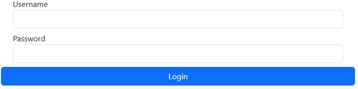
The UI with bootstrap
The UI with Tailwind
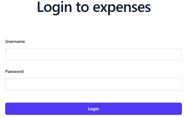
They look more or less similar, but the way the styles are applied are different.
With Tailwind, instead of creating CSS classes for different UI elements, you just use a bunch of pre-built CSS utility classes from Tailwind and adding those to the HTML element, you don’t write any CSS at all.
Instead each Tailwind class will modify the element to your liking, both layout and styles can be applied just by adding utility classes, which results a list of very long classes like following for just a button.
<button type="submit"
   class="block rounded-md px-3.5 py-2.5 text-center
         text-sm font-semibold shadow-xs
         focus-visible:outline-2 focus-visible:outline-offset-2
         focus-visible:outline-indigo-600 w-full
         bg-indigo-600 hover:bg-indigo-500 text-white">
   Login
</button>
For the above code for the Login button, the following styles were added
- block: Display the button as a block.
- rounded-md: Make the button border round.
- px-3.5: Pad both sides so the horizontal padding is 3.5rem.
- py-2.5: Pad both sides so the vertical padding is 2.5rem.
- text-center
- text-sm
- font-semibold
- shadow-xs
- bg-indigo-600: Set background to indigo color.
- hover:bg-indigo-500: Set background to lighter indigo color when hover over button.
- text-white
The pros of Tailwind are that everything is self contained in the HTML code, so you don’t have to read the CSS classes or debug CSS in the browser to figure out how the styles are applied to elements. You can
- Copy the code between projects, since the code is portable.
- No need to write and maintain custom CSS.
- The code is readable, you can basically read the classes to infer how they affect the element.
- Modifying an element is safe as changing the classes does not affect other elements.
Tailwind works by scanning the source code, check for anything that looks like Tailwind classes, then generate a CSS files with only the styles that are needed by the project.
The downside obviously is that the code for a simple form looks very cluttered, as you can see from the example of a simple button. But reading around and also checking from their documentation, it’s obvious that Tailwind was designed to work with React components in mind.
For the above example, to reduce clutter, we simply wrap the button in a React Button component for reuse.
import { MouseEventHandler } from "react"

interface ButtonProps {
    text: string
    onClick: MouseEventHandler<HTMLButtonElement>
    extraClasses?: string
    mode?: ButtonMode
}

export enum ButtonMode {
    SECONDARY
}

export function Button({text, mode, onClick, extraClasses}: ButtonProps) {
    let classes = "block rounded-md px-3.5 py-2.5 text-center text-sm font-semibold " + "shadow-xs focus-visible:outline-2 focus-visible:outline-offset-2 " + ` focus-visible:outline-indigo-600 ${extraClasses} `
    switch(mode) {
        case ButtonMode.SECONDARY:
            classes += " bg-gray-300 hover:bg-gray-200 text-black"
            break;
        default:
            classes += " bg-indigo-600 hover:bg-indigo-500 text-white"
    }
    return <button type="submit"
                onClick={onClick}
                className={classes}>
                    {text}
                </button>
}
Once you have wrapped the UI control in its own Component, the Tailwind classes only need to be written once for that component, then you simply reuse your component many times without having to write Tailwind classes multiple times. The code is not cluttered at all.
<div>
  <Button text="Button A" onClick={e => alert("A clicked")} />
  <Button text="Button B" mode={ButtonMode.SECONDARY}
    onClick={e => alert("B clicked")} />
</div>
So far, it’s very promising and interesting as well. It does seem like a good idea, an abstraction layer over CSS to make life easier for devs.
However, I had to update my Vitest tests because they were asserting some CSS classes on the UI. It would be a good idea to figure out a way to write tests that don’t change when the CSS framework is changed.